
Comparing Images, Not Racing the Clock
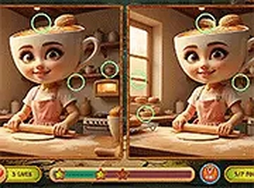
The core task in Italian Spot the Difference Challenge is straightforward: two nearly identical images sit side by side, and you tap the spots where they diverge. A difference can be a missing object, a shifted color, or an element nudged slightly out of place. Because the changes are small, the game rewards a slow, systematic scan—working top to bottom or left to right—rather than quick guessing. [IMG_1]
How the Italian Theme Shapes Each Round
Every puzzle draws on a consistent Italian aesthetic. Backgrounds show landmarks, narrow village streets, and open countryside, so each set of images feels tied to a recognizable setting rather than an abstract pattern. The bright, colorful artwork keeps the mood light and makes prolonged staring less tiring on the eyes. [IMG_2]
Difficulty That Grows Through Subtlety
Rounds are arranged in sequence, and the number of differences per round stays constant. What changes is how obvious those differences are. Early sets tend to include more visible discrepancies, while later ones hide changes in busier parts of the image. This gradual shift in subtlety keeps the activity engaging without tipping into frustration.
Controls, Feedback, and the Timer
Interaction is limited to a single action: tap or click the area where you spot a difference. The interface stays uncluttered and confirms each correct or incorrect selection immediately. A timer runs per round, but it is not aggressive—it nudges you to stay focused rather than forcing frantic play. Too many wrong taps can end the round early, so accuracy matters more than raw speed. The game runs in a web browser on desktop and mobile without a download.







Editorial Notes